Top10 Live Casino Gameshows of 2024
Alright, so back in the day, we had the traditional casino vibe, then the internet brought in the online casinos, and now we’ve got Live Casinos bringing it all back home. Almost every legit online casino these days offers Live Casino Game shows, and today, we’re checking out the top picks from Evolution and the rest of providers giving you the good stuff.
- We would like to introduce you to the top-rated Evolution Live Casino show games.
- Another live casino provider that should be on your gameshow list is Playtech.
- Also discover the exciting Pragmatic Play live casino gameshows.
It’s hardly surprising that you can experience the Evolution live casino at almost every reputable online casino these days. After all, this provider is considered a true pioneer in the industry.
After more and more online casinos appeared on the internet, Evolution set out to bring the true live feeling to the World Wide Web. At the end of 2018, Dream Catcher, the first online casino live game show from Evolution, was launched on the market.
The portfolio is constantly growing, which is reason enough to present Evolution’s current range of gameshows here. The shows are broadcast live every day from various studios in Europe and North America – for example in Riga (main studio), Malta, Bucharest and Vancouver.
Crazy Time: A crazy show awaits you
- Minimum bet per round: €0.10
- Maximum bet per round: €2,500
- Game round duration: 30 seconds

Crazy Time is based on the concept of the successful live casino game show Dream Catcher, which we will discuss in more detail later. Admittedly, the game concept is not immediately obvious, but the live host will guide you through the rounds with ease.
The Crazy Time live casino game show is very similar to Dream Catcher. The wheel of fortune offers 8 betting options. As soon as the host spins the wheel, the TOP slot mini-game starts. This slot machine with two reels determines the multiplier and a field to which it then applies. The flapper on the wheel indicates the win.
After the main spin, various bonus features are activated:
- Cash Hunt: Here you go on the hunt for multipliers by “shooting” at symbols that you select with the cursor, just like at a shooting gallery at the funfair.
- Pachinko: In this bonus game, a ball falls down a wall of pins. The place where the ball lands determines the multiplier.
- Coin Flip: This is a digital coin toss in which both sides of the coin are randomly assigned a certain multiplier.
- Crazy Time: The eponymous bonus game is definitely the main attraction of this casino game show. If the feature is activated, almost every one of the 64 bonus fields is a hit. With a little luck, you can achieve multipliers of up to 20,000x.
MONOPOLY Live: A reference to the popular board game
- Minimum bet per round: €0.10
- Maximum bet per round: €2,500
- Duration of game round: 45 seconds

Probably the best-known board game in the Wheel of Fortune version is now considered a game show classic. The game has been equipped with a modified version of the Dream Catcher wheel, which entices with additional instant wins and multipliers. If you make it to the 3D bonus round, the dice are thrown onto the MONOPOLY Live playing field and things can get really lucrative.
The game runs as follows: You tap on a wheel of fortune to see where the wheel comes to a stop. The wheel of fortune has 54 fields of equal size, 48 of which are occupied by the numbers 1, 2, 5 and 10. If the wheel lands here, you receive a prize according to the payout table.
If you hit one of the two event fields, you will receive an event card. This can earn you either cash prizes or multipliers. Cash goes to all players, the multiplier is re-spun and this multiplier counts towards the winnings of the following round.
The remaining fields show “2x dice roll” and “4x dice roll”. This is where the 3D bonus game is unlocked. This is how you reach the actual Monopoly feature. Mr Monopoly takes the steps you have rolled on the playing field. The street he lands on determines your additional win.
Our tip: Use the “Bet on all” function more often, as this gives you more chances of winning.
Dream Catcher: Dreams come true here
- Minimum bet per round: €0.10
- Maximum bet per round: €2,000
- Game round duration: 40 seconds

Dream Catcher has opened up the market for casino game shows. In this game, you have to guess whether the wheel of fortune will land on the number 1, 2, 5, 10, 20 or 40. The payouts are calculated accordingly.
The bonus spin multiplier x2 or even x7 increases the fun of the game, which is provided by the motivating presenter and the different camera angles alone.
The game principle is very simple:
You tap on the square you suspect and hope for it to come.
If another field is hit, you lose your bet – but that’s only fair.
If you are correct with your prediction, the number fields increase your winnings, which can rise even further thanks to the multipliers.

The Lightning Gameshows: Enormous profits possible thanks to multipliers
Lightning Roulette
- Minimum bet per round: €0.20
- Maximum bet per round: €5,000
- Game round duration: Approximately 55 seconds
Evolution has equipped some of its casino gameshows with the so-called Lightning Feature. This is a multiplier that can multiply your winnings.
In Lightning Roulette, the random number generator comes into play after you have placed your bets. An algorithm selects one to five numbers, which are given a multiplier of up to 500x. If you’re after big winnings, you should primarily bet on plein bets.
Lightning Dice

- Payout ratio: 96.21%
- Minimum bet per spin: €0.20
- Maximum bet per round: €2,000
- Duration of game round: Approx. 60 seconds
Lightning Dice is played as usual with three standard dice. You try to predict the total sum of the dice. The lightning feature also starts after the betting time has expired. At least one lightning number is determined per round and comes with a multiplier of up to 1,000x.
Lightning Baccarat
- Minimum bet per round: €1.00
- Maximum bet per round: €2,000
- Duration of game round: Approx. 30 seconds
In Lightning Baccarat, 20 per cent of the stakes are calculated as a Lightning side bet. As with normal baccarat, you can bet on the player, the bank or a draw and also place side bets. In the lightning round, up to five cards are drawn, giving you a 2x to 8x multiplier.
Lightning Blackjack
- Minimum bet per round: €1.00
- Maximum bet per round: €5,000
- Game round duration: Approx. 50 seconds
And then there’s Lightning Blackjack. As you can win massive winnings in this live casino game show, a 100 per cent lightning fee is charged in addition to the actual stake. If the hand wins, you can always expect a 2x to 8x multiplier, which is only activated in the following game round.
Deal or No Deal Live: A quasi remake of the well-known TV show
- Minimum bet per round: €1.00
- Maximum bet per round: €4,500
- Duration of game round: Approx. 5 minutes
Deal or No Deal in the Live Casino is based on the well-known TV show. The live version is very similar to its role model and hardly resembles a casino. You first have to qualify for the round on a type of RNG-controlled slot machine before you are told “Deal or No Deal?”.

In the qualification phase, you have to match three golden rows on a wheel of fortune. As this is not always easy, you can simply increase your stake to get up to two more rows. This is followed by the prize boosting phase, in which random multipliers increase the potential winnings of a suitcase or even several suitcases to between 5x and 50x.
This is followed by the suitcase opening phase. The aim is to estimate whether the amount of money in the closed suitcases is higher than the bank’s offer. After each suitcase is opened, you are offered a certain amount of money for its contents. The question then becomes “Deal or No Deal”.
Mega Ball: A must for every bingo fan
- Minimum bet per round: €0.10
- Maximum bet per round: €100
- Game round duration: 90 seconds
- Maximum win: 1,000,000x
The colourful bingo show Mega Ball is brand new. 51 coloured balls fly through the drum and have to form rows or columns with your pre-purchased tickets as usual. At the very end, the eponymous “Mega Ball” is drawn, which allows you to benefit from a multiplier of up to one million.

In detail, the game works as follows:
- You first buy bingo cards.
- Various packages are offered for this, with up to 400 cards possible in total.
- Then 20 of the 51 balls in the lottery drum are drawn.
- After the main round, there are one or two Mega Ball bonus rounds with a 5x to 100x multiplier on a slot reel.
If you complete a line with a bonus number, the multiplier is applied to the entire card. In all other cases, the number counts as a normal ball.
Super Sic Bo: One of the most popular dice games also available live
- Minimum bet per round: €0.20
- Maximum bet per round: €5,000
- Game round duration: Approx. 25 seconds
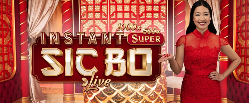
The casino dice game Sic Bo also gets a new look at Evolution Live. In terms of atmosphere, however, the game can hardly be recognised as a game show. The dice roll as usual, but various bet spots are provided with multipliers and increase the action.
The classic Sic Bo rules form the basis of the game. So you have to predict which numbers will be rolled. The multiplier also comes into play here. Because when the dice are rolling, multipliers are randomly placed on the playing field. Some of these promise up to 1,000 times the winnings. If the field with the multiplier lights up, the winnings are multiplied.
Side Bet City: The perfect live casino game show for poker fans
- Minimum bet per round: €0.50
- Maximum bet per round: €100
- Duration of game round: Approx. 40 seconds
Just like Marty McFly in the film, you jump back to the year 1985 and experience exciting hours in the Las Vegas Neon poker room. The main character in Side Bet City is a standard poker deck with 52 cards. The playing cards are reshuffled after each round.
First, the players and the dealer each receive three cards. Then four community cards are laid out. You can not only bet on the hand with 3, 5 or 7 cards, but also on “All Lose” – i.e. that all your hands will lose.
Our tip: Don’t bet on “All Lose”, as this is the least likely option.
Gonzo’s Treasure Hunt: Slot entertainment packaged as a live game show
- Minimum bet per round: €0.10
- Maximum bet per round: €1,000
- Game round duration: Approx. 90 seconds

In Gonzo’s Treasure Hunt from Evolution, you embark on a search for the lost treasures of El Dorado. Unlike in the NetEnt slot Gonzo’s Quest, here you have to guess under which field the treasure is located.
First, you place bets on one or more stones. Then you determine the number of bets. You can uncover up to 20 of the 70 squares. If you find the treasure, you can look forward to a big win.
Once the collection phase is complete, the prize drop function starts. Prizes with a value between +3 and +100 now drop from the stone wall (provided there is an opening). The prize fields connect with randomly selected stones, making them more valuable. Multipliers of up to 10x can also appear in the top row.

Playtech also has a lot going on in the casino gameshows
Another top provider in terms of live game shows casino games is definitely the provider Playtech, which can emulate the success of Evolution in the Playtech online casinos. In our experience, however, it is difficult to find casinos with Playtech game shows in each country.
The provider Playtech originally comes from Estonia, but is now based on the Isle of Man. The shows are primarily streamed from the impressive 8500 square metre studio in Riga.
Buffalo Blitz Live: Playtech’s most popular casino game show
- Minimum bet per round: €0.40
- Maximum bet per round: €2.00
- Duration of game round: Not specified
This live slot is the perfect symbiosis of live entertainment and slots devotion. Strictly speaking, the often female hostess only acts as your extended arm at the slot machine, but the charm, humour and sophisticated backdrop make it much more than a typical online slot machine.
The gameplay is therefore quickly explained, as you are actually playing a slot machine without pulling the lever yourself. This is done by the lady standing next to the slot machine. However, one thing should not go unmentioned: In addition to a scatter, the game includes a wild symbol in the form of a diamond, which can appear on reels 2 to 6.
Spin a Win: A classic game show with a wheel of fortune
- Minimum bet per spin: €0.10
- Maximum bet per spin: €500
- Duration of game round: Approx. 50 seconds
- Maximum win: Not specified
What Dream Catcher is to Evolution, the Spin a Win wheel of fortune with 53 fields is to Playtech. Here too, the values are 1, 2, 5, 10, 20 and 40, and the game of chance is enhanced by the x2 and x7 multipliers. Three side bets similar to roulette (odd, even, multiplier) round off the live experience.
The game principle couldn’t be simpler here either:
- First, you place your bets on your favourite fields.
- Then the wheel of fortune is spun.
- If it stops on a multiplier, further spins follow until the wheel displays a winning number.

Quantum Roulette and Quantum Blackjack: High multipliers beckon
Quantum Roulette
- Minimum bet per round: €0.20
- Maximum bet per round: €500
- Game round duration: Approx. 50 seconds
The studio shines in cosmic shades of blue, the roulette wheel or the blackjack table take centre stage and the croupiers become entertainers. Although there is no lightning here, there are Quantum multipliers, which make individual fields or cards particularly worthwhile and are also the main difference to the classic variants of blackjack and roulette.
Quantum Blackjack
- Minimum bet per round: €1.00
- Maximum bet per round: €500
- Game round duration: Approx. 50 seconds
How do the Quantum multipliers work? In Quantum Roulette, up to five positions are given a 50x to 500x multiplier, the value of which, with a little luck, is increased by the Quantum Boost. In Quantum Blackjack, you can benefit from up to three multipliers (3x, 5x or 10x each).
Live Hi-Lo: A classic card game as a live casino game show
- Minimum bet per round: €0.20
- Maximum bet per round: €1,000
- Duration of game round: Not specified
In this card show in front of a wooden wall you have to put your oracle skills to the test once again. A card is drawn by the host and you have to predict whether the next card will be higher, lower or the same amount (“snap”). Each option has its own odds and, as always, you can chat with the live dealer and friends via the chat.
In Live Hi-Lo, you will receive a starting card for orientation. You then have to decide whether the next card is higher or lower and set your stake accordingly. However, you can also bet on which playing card will appear in the next round.
The dealer then draws three cards, which are not revealed, and then a fourth playing card, on which everything depends. Finally, the evaluation and payout of winnings takes place before the next round starts. The card drawn acts as the orientation card in the new round.
Adventures beyond Wonderland: Wheel of fortune gameplay with three bonus features
- Minimum bet per spin: €0.10
- Maximum bet per spin: €1,000
- Duration of game round: Not specified

With Adventures beyond Wonderland, Playtech has developed another live casino game show with a wheel of fortune that is thematically inspired by the bestseller “Alice in Wonderland”. Some characters from the book have even been integrated into the game, which you will encounter in the bonus rounds.
The additional features are also the most interesting in this game, which we will discuss in more detail below:
WonderSpins: You receive a certain number of free spins with two additional wheels of fortune, which can earn you cash prizes and multipliers, among other things.
Magic Dice: In this bonus game, you have to climb up a special playing field. If you succeed, you will be rewarded with 200 times your stake.
Mystery Bonus: If the feature is triggered, you benefit from multipliers. You either receive a multiplier prize that is added to all winnings in the bonus round or multipliers rain down on the numbers.
Live Casino games from Pragmatic Play increasingly available
It would go beyond the scope of this article to present all live casino games. While NetEnt and Microgaming tend to focus on classic live table games, other developer studios such as Lucky Streak, Vivogaming and Absolute Live Gaming can only be found sporadically in the live casino. Perhaps worth mentioning is Ezugi Live, which organises two well-known game shows, Bet On Numbers and Keno.
However, Pragmatic Play or Pragmatic Play Live is another live provider that we do not want to withhold from you.
In recent months in particular, the number of casinos offering all or almost all of Pragmatic’s casino game shows has increased significantly.
The game developer was founded in 2007 as TopGames and was renamed Pragmatic Play in 2015. Originally, the company’s portfolio mainly comprised slot machines, but for some time now it has also included a range of live casino tables and the odd game show.
Pragmatic’s live studio, which opened in 2019, is located in Bucharest, Romania.
Sweet Bonanza Candyland: A mix of wheel of fortune and slot
- Minimum bet per spin: €0.20
- Maximum bet per round: €3,000
- Duration of game round: Approx. 40 seconds

Sweet Bonanza Candyland falls into the category of “new casino gameshows”, as the game was only released at the end of 2021. In detail, the live show is a combination of Money Wheels and the popular slot Sweet Bonanza.
As with other wheel of fortune gameshows, your task is to predict the field on which the Flapper will stop. The Sweet Bonanza wheel is made up of 54 segments, most of which display the numbers 1, 2, 5 and 10. Five of the fields trigger special or bonus functions:
- Sweet Spins symbol (available once): You receive a fixed number of Free Spins, for which the reel setup expands to 6×5. The feature has also been equipped with a cascading win function, which means that winning symbols are removed from the reels to make room for new symbols.
- Candy Drop symbol (available twice): This triggers a Pachinko bonus game in which the dealer drops a ball that you use to collect multipliers.
- Sugar Bomb symbol (present 2 times): This special symbol rewards you with a random multiplier, which can be up to 100x.
Mega Wheel: Ideal for new players and purists
- Minimum bet per round: €0.10
- Maximum bet per round: €1,000
- Game round duration: Approx. 40 seconds

As the name suggests, Mega Wheel is inspired by classic wheel of fortune formats. Thanks to specially trained presenters, gambling almost feels like taking part in a TV game show.
Thanks to the simple rules, even inexperienced gamblers will have fun with Mega Wheel. What’s more, the live casino game show does without any bonus features, which will certainly please nostalgic gamblers.
As in Sweet Bonanza Candyland, the wheel of fortune consists of 54 fields, which display the numbers 1, 2, 5, 8, 10, 15, 20, 30 and 40. If you are correct with your prediction, you will receive the corresponding prize.
New casino game shows: always up to date with us
The world of online casinos never stands still, as the gambling providers and providers are of course always endeavouring to expand or improve their range. Below we will introduce you to the most interesting new casino game shows.
Start your game with real live dealers in 4 simple steps!
With the following steps you can start your live casino adventure right away and directly below we give you some tips that you should keep in mind to get the best possible gaming experience.
Step 1: Create an account with the help of our step-by-step instructions and top up your bankroll via the available channels.
Step 2: From then on, the live game show is nothing more than a gaming app in the casino’s general offering, often found under its own menu item “Live Casino”.
Step 3: Simply click in and the rest is pretty straightforward. If you have any questions, the hosts will of course be happy to help you and general support is available as usual anyway.
Special features of the game shows in the live casino
The main difference in the live casino is that other people are involved in your game. This gives you the advantage of being able to talk to the croupier or other players at any time. Furthermore, the professional croupiers create a real casino atmosphere from the comfort of your own home!
Unfortunately, there are no play money versions in this category of games of chance where you can practise the processes. If you want to play game shows in the online casino, you have to play for real money.
To top it all off, in live action it’s always “The show must go on”, which is why the next round starts without your consent. If you want to avoid this pressure, you can just watch the first few rounds and familiarise yourself with the shows or play the first-person versions. Instead of live images, however, only animations whiz across the screen.
Three top casinos for your game show nights
As already mentioned, you can almost always find one game show or another on offer at online casinos these days. Evolution Live in particular is widespread, but there are of course always minor differences in which games are included in the portfolio.
Our detailed tests will always tell you in detail which online casino games and which limits you can expect to find there. To make your search a little easier, here are three great online casinos where you can put what you’ve learnt here into practice.